July 17 marked the 200th day of counting the number of infections and deaths arising from the Covid-19 pandemic, writes Dr John Egan.
This count by the European Centre for Disease Prevention and Control (ECDC) began with 27 cases on the first day of 2020. By last Friday the number had reached 13,788,300 across 209 countries. Up to that day, 589,688 people worldwide had died because of the Covid-19 disease. Many more will have been missed by this global census.
Since Friday, the numerical progression of infection has been simulated many thousands of times “in-silico”, as a computer algorithm, to see what this pattern might reveal about the coronavirus that is not directly apparent from the raw data. It indicates that globally, over the past 200 days, the virus is changing from an initial Phase I behaviour, which included an early exponential growth of the number of infections, towards a subsequent distinct and stable Phase II.
These two phases of the viral infection differ in the cyclical pattern of infection > propagation > re-infection. In Phase I, the size of the clusters that are the engines of viral infection at a specific location depend on the speed the engine is turning. In Phase II, cluster size is independent of the cyclical period of infection. The patterns of regional infection are dependent on their cluster size which is a characteristic of location, together with a second parameter MBp that sets the Maxwell-Boltzmann statistics upon which the computer simulation is based.
A value of MBp parameter approaching 120 appears to be needed for the simulation to enter Phase II. The transition from Phase I can occur quite rapidly, although for the infection of the entire world, this change is more gradual and is still ongoing.
In the charts below, each dot represents a single simulated infection for a particular region and a specific duration. The simulated cluster size that represents that region and duration provides the best-fit of the simulated pattern of infection to that occurring at the same time and place in the real world. This best-fit is indicated by the lowest Root Mean Square (RMS) error between the simulation and the comparable real infection data obtained from the Our World in Data Covid-19 dataset. The individual points on each graph differ according to the different infection cycle periods they represent.
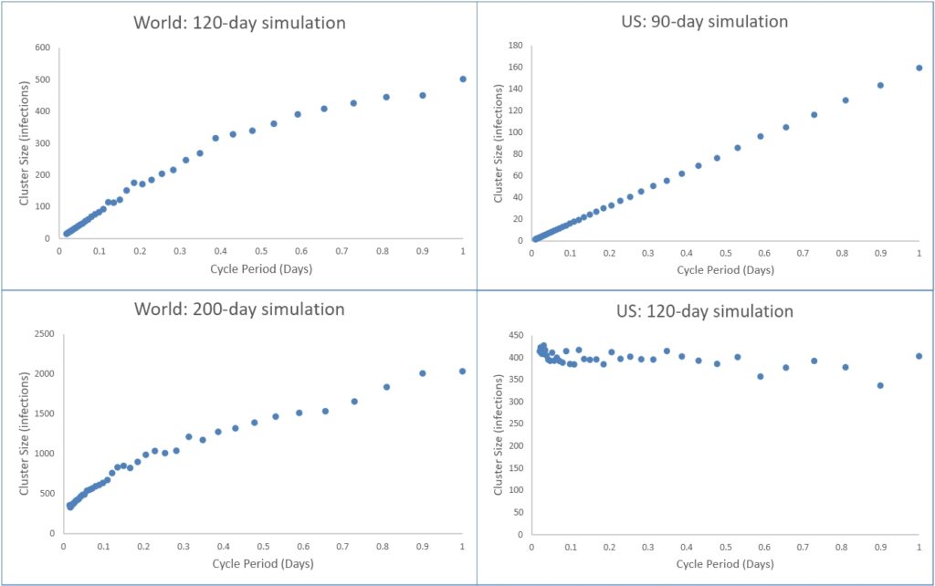
The World at 120 days and the US at 90 days both show a Phase I behaviour. The World at 200 days is in transition towards Phase II, while for the US this Phase II transition is complete by 120 days.
For the points on the four graphs above, each reporting their lowest individual RMS error, there is one error value that is the lowest of them all. This is deemed to be the best representation the model is able to provide of the real world and its parameters are uniquely descriptive of its region and duration. These representative parameter values are presented for the entire world in the table below, together with values for the United States, France, Germany, Italy, Spain and the United Kingdom.
| World | ||||||
| Simulation Duration (Days) | Phase | MBp | Cluster Size (Infections) | Cycle Period (Days) | Total Cases | % RMS Error |
| 200 | I > II | 114.37 | 356.97 | 0.0148 | 13,788,300 | 0.00112 |
| 180 | I > II | 108.09 | 191.10 | 0.0581 | 9,771,843 | 0.00133 |
| 150 | I | 91.736 | 28.420 | 0.0309 | 5,659,330 | 0.00126 |
| 120 | I | 89.50 | 16.995 | 0.0203 | 2,985,842 | 0.00257 |
| 90 | I | 97.084 | 25.178 | 0.0786 | 67,8650 | 0.00750 |
|
|
|
|
|
|
|
|
| US | ||||||
| Simulation Duration (Days) | Phase | MBp | Cluster Size (Infections) | Cycle Period (Days) | Total Cases | % RMS Error |
| 180 | II | 116.35 | 361.30 | 0.0424 | 3,773,260 | 0.00201 |
| 160 | II | 117.49 | 452.55 | 0.0646 | 2,510,323 | 0.00235 |
| 120 | II | 116.20 | 392.91 | 0.0580 | 1,508,598 | 0.00393 |
| 90 | I | 63.612 | 2.1197 | 0.0133 | 735,086 | 0.00128 |
|
|
|
|
|
|
|
|
| France | ||||||
| Simulation Duration (Days) | Phase | MBp | Cluster Size (Infections) | Cycle Period (Days) | Total Cases | % RMS Error |
| 160 | II | 119.84 | 53.643 | 0.1216 | 165,719 | 0.00641 |
| 120 | II | 116.20 | 52.178 | 0.2542 | 144,566 | 0.00779 |
| 90 | I | 78.225 | 9.5530 | 0.3487 | 119,151 | 0.00598 |
|
|
|
|
|
|
|
|
| Germany | ||||||
| Simulation Duration (Days) | Phase | MBp | Cluster Size (Infections) | Cycle Period (Days) | Total Cases | % RMS Error |
| 160 | II | 121.98 | 71.978 | 0.0250 | 196,335 | 0.00657 |
| 120 | II | 120.71 | 78.621 | 0.0886 | 179,002 | 0.00784 |
| 90 | II | 114.27 | 55.102 | 0.12158 | 154,175 | 0.00853 |
| 80 | I | 59.999 | 9.0184 | 0.34870 | 130,450 | 0.00671 |
|
|
|
|
|
|
|
|
| Italy | ||||||
| Simulation Duration (Days) | Phase | MBp | Cluster Size (Infections) | Cycle Period (Days) | Total Cases | % RMS Error |
| 160 | II | 122.01 | 87.291 | 0.0203 | 241,956 | 0.00573 |
| 120 | II | 120.69 | 78.163 | 0.0203 | 231,732 | 0.00636 |
| 90 | II | 116.50 | 61.012 | 0.0646 | 201,505 | 0.00675 |
| 80 | I | 74.030 | 4.7088 | 0.1501 | 175,925 | 0.00591 |
|
|
|
|
|
|
|
|
| Spain | ||||||
| Simulation Duration (Days) | Phase | MBp | Cluster Size (Infections) | Cycle Period (Days) | Total Cases | % RMS Error |
| 160 | II | 122.64 | 123.89 | 0.1216 | 253,056 | 0.00658 |
| 120 | II | 121.70 | 118.23 | 0.1216 | 239,228 | 0.00800 |
| 90 | II | 118.17 | 99.570 | 0.1216 | 215,183 | 0.00917 |
| 80 | II | 113.20 | 80.518 | 0.1501 | 195,470 | 0.00920 |
| 70 | I | 61.298 | 4.1532 | 0.1094 | 163,472 | 0.00606 |
|
|
|
|
|
|
|
|
| UK[1] | ||||||
| Simulation Duration (Days) | Phase | MBp | Cluster Size (Infections) | Cycle Period (Days) | Total Cases | % RMS Error |
| 154 | II | 118.43 | 83.015 | 0.1501 | 313,483 | 0.00478 |
| 120 | II | 114.85 | 59.764 | 0.1501 | 269,127 | 0.00486 |
| 90 | I | 76.233 | 5.2179 | 0.1501 | 161,145 | 0.00204 |
One might speculate that in each of the above regions, the evolving infection is moving from an initial gas-like state in Phase I into a more liquid-like Phase II. This interpretation would be a direct consequence of the computer algorithm – an energy-dissipating viscoelastic model – that has been re-purposed to simulate the viral infection. An earlier article on Chief-Exec.com pointed to its viscous fluid behaviour due to an absence of energy storage between the cycles of the simulated infection.
The objective here is to understand the thermodynamics through which viral infections can draw energy from their infected host in order for the virus to proliferate as explained in our related article. It appears in the information contained in the essential raw data of the infection patterns across the world, as shown below, together with their interpretation provided by the thermodynamic analysis.
To date we have observed:-
- The overall fit of the coronavirus infection simulation to the real world is extremely close, as indicated by low RMS values. The representative best-fit parameter values are stable and consistent across the seven regions analysed.
- One can discern the two distinctly different and stable phases of the coronavirus infection, together with a short period of transition between the two.
- Phase I: The simulated cluster size is proportional to the simulation infection cycle period and descends towards zero as this period becomes infinitesimal. The MBp values are appreciably lower than those of Phase II.
- Phase II: The simulated cluster size is independent of the simulation cycle period and is accompanied by MBp values approaching 120.
The search for enlightenment continues …
WARNING: The findings reported above must be considered as tentative. The accuracy of the data used is questionable as the database certainly does not record every case of Covid-19. It is also new. Further interpretation will be presented in subsequent articles.
Notes
[1] The analysis for the United Kingdom is terminated at day 154 because on day 155 (3 July 2020) the UK issued a correction removing 29,726 cases from their record of total Covid-19 cases. Such a gross incurred error would render impossible the close matching of model to data.
For related articles on Chief-Exec.com : Click Here

Graphics and global Covid-19 infection data credit:-
Max Roser, Hannah Ritchie, Esteban Ortiz-Ospina and Joe Hasell (2020) – “Coronavirus Pandemic (COVID-19)”.
Published online at OurWorldInData.org. Retrieved from: ‘https://ourworldindata.org/coronavirus